Most landing page optimization advice is about adding things: another testimonial, another badge, another paragraph explaining the offer. In practice the pages that convert best are usually the ones where somebody has been ruthless about taking things away. A landing page is not a website. It has one job, one audience and one next step, and nearly every change that improves it is a change that makes that single path more obvious. What follows is the order we work in when we pick up an underperforming page, starting with the change that moves the number most and ending with the ones that are worth doing only after the first seven are done.
Table of Contents
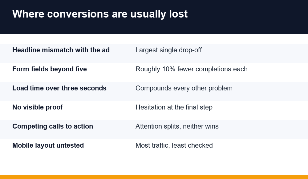
Landing page optimization starts with message match
Before anything on the page itself, look at what the visitor clicked to get there. If the ad promised a free template and the page opens with a paragraph about your company’s history, no amount of layout work will rescue it. The visitor has arrived holding an expectation, and the first thing they read either confirms it or does not.
Message match means the headline on the page repeats the promise of the ad, close to word for word. It feels repetitive when you are the one writing both. It is not repetitive to the person reading, because they are seeing the second half of a sentence that started somewhere else.
The quickest audit there is
Open your ads and your landing pages side by side in two windows and read them as a pair. Where the words diverge, the conversion rate usually does too. This takes twenty minutes and regularly finds more than a month of button testing would.
- The headline echoes the specific promise, not a general benefit
- The offer named in the ad is the offer named on the page
- The visual style is close enough that the page feels like the same place
- Any discount or figure quoted in the ad appears on the page unchanged
Give the page exactly one job
The most common structural fault is a page asking for two things at once. Download the guide, and also book a call. Start a trial, and also read the blog. Each additional option makes the primary one less likely, because choosing requires effort and the easiest choice is always to leave.
Decide what one action defines success for this page, then remove or demote everything that competes with it. Navigation menus are usually the first casualty, and removing them is among the few changes that produces a measurable lift on almost every page it is tried on.
This is uncomfortable because every link you remove is a link somebody internally argued for. The question to settle it is simple: if this page did nothing but the one action, would that be a success? If yes, everything else is decoration with a cost attached.
What actually belongs above the fold
The fold still matters, though not for the reason people usually give. Visitors do scroll. What the top of the page decides is whether they bother, and that decision takes a second or two.
Four things earn the space: what this is, who it is for, what happens when they act, and the action itself. Anything that does not answer one of those four is pushing the answers further down.
| Element | What it has to do |
|---|---|
| Headline | Name the outcome in the visitor’s own words, not your product category |
| Subhead | One sentence on how it works or who it suits |
| Visual | Show the actual thing, not a stock photo of people in a meeting |
| Call to action | State what happens next, so the button is not a leap of faith |
Button labels deserve a moment. Submit and Click here describe what the visitor does for you. Get the template and See pricing describe what they get. The second kind consistently performs better, and it costs nothing to change.
Forms: every field has a cost
Every field on a form is a small request for effort, and the effect is cumulative rather than linear. Going from three fields to eight does not cost you a little; it frequently halves completions. The sales team wants job title, company size and phone number. The visitor wants to not type all of that on a phone.
The resolution is to ask only for what you need to take the next step, and collect the rest later, once there is a relationship worth the effort. An email address and a name will carry most offers. Phone numbers in particular suppress completion sharply, because people know what a phone number leads to.
- List every field and write down what happens if you do not collect it
- Delete any field where the honest answer is “nothing immediately”
- Move anything genuinely needed into a second step after the first commitment
- Mark optional fields as optional, visibly, rather than leaving people guessing
- Never ask for the same information twice across consecutive pages
One exception worth keeping: a qualifying field that filters out people you cannot help is doing useful work even though it lowers raw conversions. Measure qualified leads rather than form fills and the picture changes.
Proof that does something
Most social proof on landing pages is decorative. A wall of logos with no context, or a testimonial saying the team was great to work with, occupies space without answering any question the visitor actually has.
Proof earns its place when it addresses the specific hesitation at that point on the page. Next to a price, a testimonial about value for money. Next to a form, a line about what happens to the data. Next to a technical claim, a number from a named customer rather than an adjective.
Specific beats impressive
A quote reading cut our reporting time from two days to about three hours works harder than one reading transformed our business, because the first is checkable and the second is what everybody writes. Where you can, use a real name, a real company and a real figure.
Speed is a conversion feature
Page speed is treated as a technical matter and handed to developers, which is how it ends up being nobody’s priority. It belongs with conversion work, because a page that takes four seconds to appear loses a slice of its audience before any of the copy gets read.
The usual culprits are predictable and most are not developer problems at all. Oversized hero images exported at print resolution. A video that autoplays and loads regardless of whether anyone watches it. Five tracking scripts, three of which belong to tools nobody has opened in a year.
- Resize images to the dimensions they actually display at, then compress them
- Audit tracking scripts and remove the ones no longer used
- Load anything below the fold only when it is scrolled towards
- Avoid web fonts you are not genuinely using, and limit the weights you load
Layout shift deserves naming too. A page where the button moves just as someone reaches for it reads as broken, and that impression carries into how they judge everything else on it.
Test on the device most people use
Landing pages are designed on large screens by people with fast connections, and then visited on phones over patchy mobile data. The gap between those two experiences is where a surprising share of lost conversions lives.
On a phone, the fold is small, the hero image can push the call to action entirely out of view, and a form that looked compact becomes a long scroll. Tap targets that work with a mouse become fiddly with a thumb. None of this shows up in a desktop preview.
The fix is unglamorous: open the page on an actual phone, on mobile data rather than office wi-fi, and complete the form yourself. Most teams find at least one blocking problem the first time they do it, and it is usually something nobody would have predicted.
Testing without fooling yourself
The last change is how you decide whether any of the others worked. Done badly, testing produces confident conclusions from noise, which is worse than not testing at all because it gets written into the playbook.
Two rules carry most of the weight. Decide the sample size before you start and do not look at the result until you reach it, because stopping early as soon as a variant leads is how random fluctuation becomes a documented best practice. And change one thing at a time, or accept that you will not know which change did it.
Test the big things first. Headline, offer and page structure move numbers in ways that button colour does not, and the industry’s fondness for button-colour stories has sent a lot of teams down a path with very little at the end of it.
Our wider guide to search optimisation covers how these pages fit into the traffic side of the picture, which is the other half of the same problem.
Three changes that waste the time
Some of the best known landing page optimization tactics survive on folklore rather than evidence, and they absorb effort that belongs elsewhere.
Button colour. The famous case studies behind this were testing contrast against the surrounding design, not the colour itself. On a page where the button already stands out, changing it from green to orange does nothing measurable, and teams have spent entire quarters finding that out.
Countdown timers on an evergreen offer. A timer that resets when the page reloads is noticed quickly, and what it costs is trust, which is the one thing a landing page cannot spare. Genuine deadlines work; manufactured ones work once.
Exit-intent popups layered onto a weak page. An exit popup is an attempt to recover visitors the page has already failed. Occasionally it recovers a few. More often it confirms that the underlying offer or message match was wrong, and the popup is treating the symptom at the cost of a worse experience for everyone who was going to convert anyway.
The pattern running through all three is that they are easy to implement and easy to report on, which is precisely why they get chosen over harder work like rewriting the offer. Honest landing page optimization usually means fixing something that takes a week, not shipping something that takes an hour.
Frequently Asked Questions
How long should a landing page be?
Long enough to answer the questions standing between the visitor and the action, and no longer. A free download usually needs very little. A considered purchase needs more, because more objections exist. Length itself is not the variable; whether each section removes a specific hesitation is.
What is a good landing page conversion rate?
It varies so widely by offer and traffic source that benchmarks are close to useless. A newsletter sign-up and a demo request for enterprise software are not comparable. The number worth watching is your own page’s rate over time, measured against itself after each change.
Should the call to action be repeated down the page?
On anything longer than a screen or two, yes. Visitors decide at different points, and making somebody scroll back up to act adds friction at the exact moment they were ready. Repeat the same action rather than introducing a second, different one.
Do video backgrounds help conversions?
Rarely enough to justify the cost. They are heavy, they delay the page, and they often compete with the headline for attention. A still image of the actual product usually outperforms a decorative video, and loads in a fraction of the time.
How many fields should a form have?
As few as the next step genuinely requires, which for most offers is two or three. Each additional field reduces completions, and phone number fields reduce them sharply. Anything you want for qualification rather than delivery can be collected after the first commitment.